ShopDreamUp AI ArtDreamUp
Deviation Actions


![[CE]: Oyasumi Nasai](https://images-wixmp-ed30a86b8c4ca887773594c2.wixmp.com/f/a8c1969a-5051-4c6f-b5e0-79374a589564/d7tj2gm-3c9a3403-78d3-405c-a10e-430eadf61dae.png/v1/crop/w_184,h_184,x_19,y_0,scl_0.074193548387097,q_70,strp/_ce___oyasumi_nasai_by_kuredesu_d7tj2gm-92s-2x.jpg?token=eyJ0eXAiOiJKV1QiLCJhbGciOiJIUzI1NiJ9.eyJzdWIiOiJ1cm46YXBwOjdlMGQxODg5ODIyNjQzNzNhNWYwZDQxNWVhMGQyNmUwIiwiaXNzIjoidXJuOmFwcDo3ZTBkMTg4OTgyMjY0MzczYTVmMGQ0MTVlYTBkMjZlMCIsIm9iaiI6W1t7ImhlaWdodCI6Ijw9NjM3IiwicGF0aCI6IlwvZlwvYThjMTk2OWEtNTA1MS00YzZmLWI1ZTAtNzkzNzRhNTg5NTY0XC9kN3RqMmdtLTNjOWEzNDAzLTc4ZDMtNDA1Yy1hMTBlLTQzMGVhZGY2MWRhZS5wbmciLCJ3aWR0aCI6Ijw9OTAwIn1dXSwiYXVkIjpbInVybjpzZXJ2aWNlOmltYWdlLm9wZXJhdGlvbnMiXX0.VGdW7BBBbX1r-jgTWY0TVGIqFrmCD3Xk9pNCa8K1wDQ)
![[CE]: Oyasumi Nasai](https://images-wixmp-ed30a86b8c4ca887773594c2.wixmp.com/f/a8c1969a-5051-4c6f-b5e0-79374a589564/d7tj2gm-3c9a3403-78d3-405c-a10e-430eadf61dae.png/v1/crop/w_92,h_92,x_10,y_0,scl_0.037096774193548,q_70,strp/_ce___oyasumi_nasai_by_kuredesu_d7tj2gm-92s.jpg?token=eyJ0eXAiOiJKV1QiLCJhbGciOiJIUzI1NiJ9.eyJzdWIiOiJ1cm46YXBwOjdlMGQxODg5ODIyNjQzNzNhNWYwZDQxNWVhMGQyNmUwIiwiaXNzIjoidXJuOmFwcDo3ZTBkMTg4OTgyMjY0MzczYTVmMGQ0MTVlYTBkMjZlMCIsIm9iaiI6W1t7ImhlaWdodCI6Ijw9NjM3IiwicGF0aCI6IlwvZlwvYThjMTk2OWEtNTA1MS00YzZmLWI1ZTAtNzkzNzRhNTg5NTY0XC9kN3RqMmdtLTNjOWEzNDAzLTc4ZDMtNDA1Yy1hMTBlLTQzMGVhZGY2MWRhZS5wbmciLCJ3aWR0aCI6Ijw9OTAwIn1dXSwiYXVkIjpbInVybjpzZXJ2aWNlOmltYWdlLm9wZXJhdGlvbnMiXX0.VGdW7BBBbX1r-jgTWY0TVGIqFrmCD3Xk9pNCa8K1wDQ)


![[CE] Tsubasa no Sei :: Tai](https://images-wixmp-ed30a86b8c4ca887773594c2.wixmp.com/f/9982c032-51d7-40f9-9d90-e8e43b67e8c3/d6t7j2k-a5f039ac-9db2-4efc-8d02-e7918fb21aaa.jpg/v1/crop/w_184,h_184,x_0,y_17,scl_0.19368421052632,q_70,strp/_ce__tsubasa_no_sei____tai_by_asakurashinji_d6t7j2k-92s-2x.jpg?token=eyJ0eXAiOiJKV1QiLCJhbGciOiJIUzI1NiJ9.eyJzdWIiOiJ1cm46YXBwOjdlMGQxODg5ODIyNjQzNzNhNWYwZDQxNWVhMGQyNmUwIiwiaXNzIjoidXJuOmFwcDo3ZTBkMTg4OTgyMjY0MzczYTVmMGQ0MTVlYTBkMjZlMCIsIm9iaiI6W1t7ImhlaWdodCI6Ijw9MTMwMCIsInBhdGgiOiJcL2ZcLzk5ODJjMDMyLTUxZDctNDBmOS05ZDkwLWU4ZTQzYjY3ZThjM1wvZDZ0N2oyay1hNWYwMzlhYy05ZGIyLTRlZmMtOGQwMi1lNzkxOGZiMjFhYWEuanBnIiwid2lkdGgiOiI8PTk1MCJ9XV0sImF1ZCI6WyJ1cm46c2VydmljZTppbWFnZS5vcGVyYXRpb25zIl19.FM4McBu2JYvjpRgvDo_tfN1Lp2c3skMuFSnwvkMKNmE)
![[CE] Tsubasa no Sei :: Tai](https://images-wixmp-ed30a86b8c4ca887773594c2.wixmp.com/f/9982c032-51d7-40f9-9d90-e8e43b67e8c3/d6t7j2k-a5f039ac-9db2-4efc-8d02-e7918fb21aaa.jpg/v1/crop/w_92,h_92,x_0,y_8,scl_0.096842105263158,q_70,strp/_ce__tsubasa_no_sei____tai_by_asakurashinji_d6t7j2k-92s.jpg?token=eyJ0eXAiOiJKV1QiLCJhbGciOiJIUzI1NiJ9.eyJzdWIiOiJ1cm46YXBwOjdlMGQxODg5ODIyNjQzNzNhNWYwZDQxNWVhMGQyNmUwIiwiaXNzIjoidXJuOmFwcDo3ZTBkMTg4OTgyMjY0MzczYTVmMGQ0MTVlYTBkMjZlMCIsIm9iaiI6W1t7ImhlaWdodCI6Ijw9MTMwMCIsInBhdGgiOiJcL2ZcLzk5ODJjMDMyLTUxZDctNDBmOS05ZDkwLWU4ZTQzYjY3ZThjM1wvZDZ0N2oyay1hNWYwMzlhYy05ZGIyLTRlZmMtOGQwMi1lNzkxOGZiMjFhYWEuanBnIiwid2lkdGgiOiI8PTk1MCJ9XV0sImF1ZCI6WyJ1cm46c2VydmljZTppbWFnZS5vcGVyYXRpb25zIl19.FM4McBu2JYvjpRgvDo_tfN1Lp2c3skMuFSnwvkMKNmE)


Description
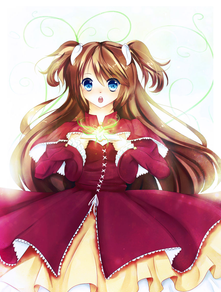
my art trade part for sakuraGx4nina
sorry this took a while!
i tried to put the highlights in her hair, but it seems the overlays i use to edit in photoshop hid them a bit......aughhh doilies.....
e=-ehehee anyways this is haruyo~ a goddess of earth, and this is a simple bg, with a
bit of that dathie abra-kadabra-alakazam
(yes, i know i just named 3 pokemon but what can you do, its pokemons fault, not mine!)
anyways, i hope you like it, im gonna finish watching the world stupidest film sharknado and then....flap maybe???? idk
(ughh sorry i just realised today that my oven button sounds are the same as the ones used in flipping FLAPPY BIRD!)
so before i continue with rambling nonsense:
art (c) dathie
character (c) sakuraGx4nina
and i bid you, adiu....until i stop being a duck being daffy.... did that even make sense.....
Image size
1024x1350px 1.7 MB
© 2014 - 2024 dathie
Comments27
Join the community to add your comment. Already a deviant? Log In
Pre-apology for my messy critiquing because I'm scatter-brained~
Anyways, firstly I'd like to start with the anatomy. With the style you seem to be going for, the neck is too wide and long making it have a sorta masculine look. The pose is also a bit stiff and awkward. When doing a pose think to yourself of how realistic it is and try holding your own body in that pose. When you hold a book how do you hold it? How is it angled? If you answered these just now you should be able to see the problem.
Next, I'd like to touch up a bit more on the book she is holding. There seems to be light coming from inside the book but the light is not really bouncing onto her much. If a bright light like that is that close to her there should be indication of that light source on her, not just some airbrushed light color on low opacity. And there should also be a shadow onto the hands because of the book and how it is angled.
The wrinkles and folds of the sleeves are a bit weird also. One sleeve looks more tightly fitted than the other, and the folds aren't quite too realistic. Folds should fit around a figure's shape.
The way the face and neck are shaded make her look flat, add more solid shadows like in the eyelids or on the nose or shadows cast from the hair can help form more shape.
That is most of the things I'd like to correct. But, hey they say if something isn't hard you are doing it wrong xD. I recommend to perhaps study some of the basics and doing life drawings to help you better form and proportion your figure.
Great work and keep working hard~